DESIGNS
DATA VISUALIZATIONS
This data visualization project on women’s empowerment in India has been selected by the Journalism + Design faculty for the Spring 2023 Skybridge Exhibit at The New School. I used Adobe Illustrator, Canva, Adobe Express and Google Sheets to analyze and visualize large datasets from the National Health Survey of India.


This data visualization is about Woodside Queens, also known as "Little Manila" in New York City. I used Adobe Illustrator, Adobe Express and Google Sheets to analyze and visualize large datasets from Census Reporter and Zillow.


Here are some more fun little data viz I created purely on Adobe Illustrator, formatted for Instagram with my logo on the bottom right. The first two slides are based on my own Starbucks spending data that I've kept track of on Google Sheets. The third is based purely on my unwavering love for Grogu. I decided to create this to see what I could have bought instead if I just saved and made food more at home.
SOCIAL MEDIA GRAPHICS - INSTAGRAM
Some promotional stills and motion graphics I made for my food blog, Franchette's Fork. These are formatted for IG stories, posts, and Youtube. Created using Adobe Illustrator and Express.
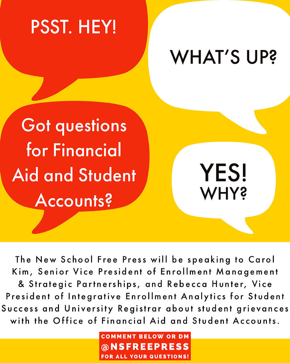
As the Social Media Editor for The New School Free Press, I designed graphics to promote our published stories on social media. I used Adobe Illustrator and Adobe Express, collaborating with reporters and editors to highlight each piece's sound bytes.


BRANDING + PAPER PRODUCTS
Banana Nation is a concept brand I created which empowers exploited banana farmers in developing nations. Here are some physical paper products I designed with an original logo and brand language. This was for my Information Design course at Parsons School of Design at The New School.


